Jan 19, 2025
This guide highlights the top makeup mistakes people with deep winter color palettes should avoid, focusing on embracing cool tones, bold contrasts, and rich, jewel-like colors to enhance their natural beauty.
Palette uses advanced AI techniques tailored for color analysis and photoshoots.
GET YOUR COLORS


Avoid These Makeup Mistakes if You’re a Deep Winter
If you belong to the Deep Winter seasonal color palette, your striking, cool-toned features thrive with makeup choices that reflect your natural depth and contrast. However, using the wrong shades or techniques can wash you out or clash with your unique coloring. Here are the most common makeup mistakes Deep Winters make—and how to fix them.
1. Using Warm Undertones
Deep Winter features are enhanced by cool, crisp colors. Warm tones like peach, golden brown, or coral can make your skin look sallow and your overall appearance dull.
Better Choice: Opt for cool-toned blushes like rose pink, cool plum, or a deep berry hue.
Try This: Look for blushes labeled with "cool" or "blue-based" tones. Examples include Lamel Blush Cheek Color Taupe or Maybelline Fit Me Blush in Plum.
2. Choosing Neutral or Warm Foundation
While it might seem safer to choose a "neutral" foundation, most Deep Winters have cool undertones that require a foundation with a pink or blue base. Warm foundations with yellow undertones will look mismatched on your skin.
Better Choice: Look for foundations specifically designed for cool undertones.
Try This: L’Oréal Paris True Match Foundation (Cool Tone Shades) provides a range of cool options to suit various skin tones.
3. Overlooking Jewel-Toned Eye Shadows
Deep Winters can handle bold, saturated shades, yet many stick to muted browns or overly warm neutrals that don't harmonize with their natural coloring.
Better Choice: Focus on rich, jewel-toned shades like emerald green, deep sapphire blue, and charcoal gray.
Try This: NYX Professional Makeup Ultimate Shadow Palette in Smokey & Highlight, which includes dramatic, cool-toned shades ideal for Deep Winter.
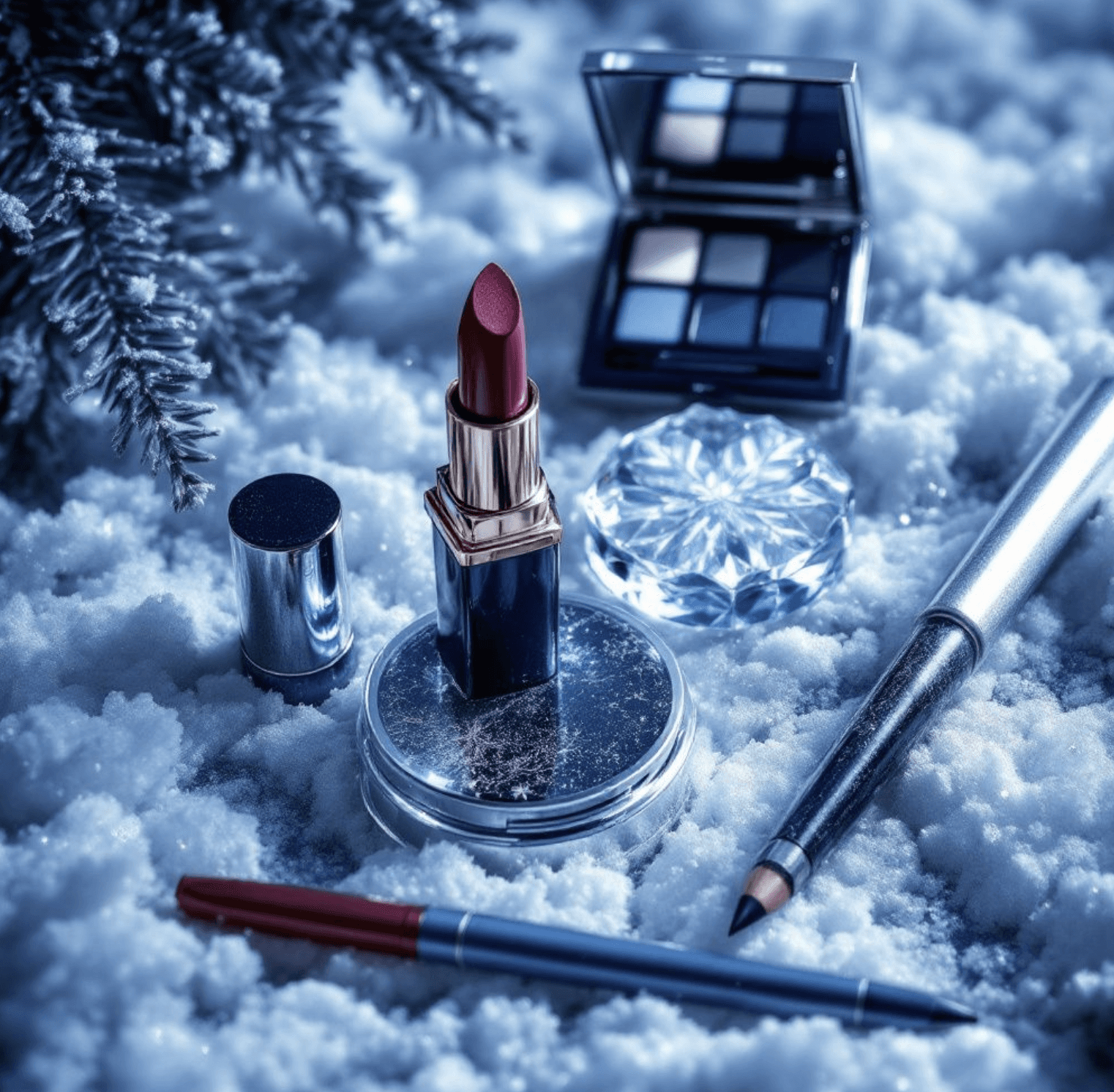
4. Wearing Warm or Golden Lip Colors
Lipsticks in shades of orange, coral, or warm reds can clash with your cool undertones, making your complexion look uneven or overly harsh.
Better Choice: Stick to cool reds, deep berries, or even bold magentas.
Try This: Revlon Super Lustrous Lipstick in Cherries in the Snow is a classic, cool-toned red that flatters Deep Winters beautifully.
5. Neglecting Contrast in Makeup
Deep Winter features thrive on high contrast, yet using colors that are too light or muted can leave you looking washed out.
Better Choice: Ensure that your eyeliner, mascara, and other defining products are jet black, deep navy, or cool charcoal. Avoid brown tones unless they are very dark and cool.
Try This: Maybelline Hyper Easy Liquid Eyeliner in Pitch Black and L’Oréal Paris Voluminous Mascara in Carbon Black.
6. Going Too Soft or Sheer
Soft, sheer makeup often lacks the intensity needed to match Deep Winter's bold features. Pastel shades or light washes of color can make you appear tired or washed out.
Better Choice: Choose pigmented products that provide depth and richness. For example, swap sheer pink lip gloss for a rich berry lipstick or light gray shadow for a deep charcoal.
Try This: Milani Baked Blush in Berry Amore for a pop of color that’s both bold and flattering.
7. Ignoring Cool Highlighters
Warm or champagne highlighters might look beautiful in the pan, but they often clash with Deep Winter’s cool complexion. They can appear too golden or even muddy on your skin.
Better Choice: Use icy or cool-toned highlighters with hints of silver or pearlescent white.
Try This: Wet n Wild MegaGlo Highlighting Powder in Blossom Glow for a cool shimmer that enhances your natural glow.
8. Forgetting the Power of Cool Nails
While nails might seem like a minor detail, warm nail colors like peach, coral, or golden tones can subtly disrupt the harmony of your overall look.
Better Choice: Opt for nail colors like deep plum, cool red, or sapphire blue to align with your palette.
Try This: OPI Nail Lacquer in Lincoln Park After Dark, a classic deep plum shade.
9. Overlooking Brow Products
Your brows frame your face, and choosing warm-toned brow products can look unnatural. Avoid browns that lean orange or golden.
Better Choice: Go for cool-toned brow products in ash brown or charcoal.
Try This: Anastasia Beverly Hills Brow Powder Duo in Ash Brown for natural-looking definition.
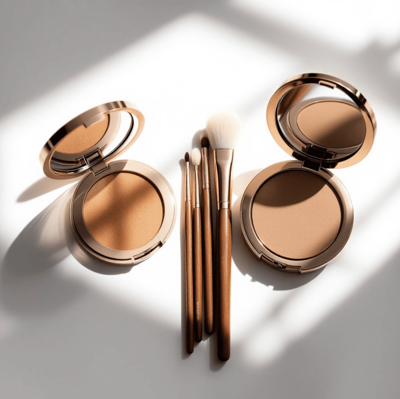
10. Using Too Much Bronzer
Bronzer can add warmth, but most Deep Winters don’t need it—and using warm-toned bronzers can clash with your natural cool undertones.
Better Choice: If you want to contour, use a cool-toned product instead of a traditional bronzer.
Try This: Kevyn Aucoin Sculpting Powder in Medium, a cool-toned contour powder.
Key Takeaways
For Deep Winters, staying true to cool undertones, bold contrasts, and rich, jewel-like colors is the secret to enhancing your natural beauty. Avoiding warm, muted, or sheer products will ensure your makeup complements your striking features.
Learn more about eye shadow for the deep winter color palette.